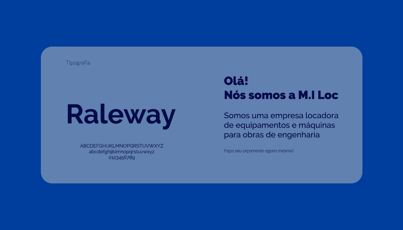
Sobre o projeto [PT]
A criação da identidade visual da M.I Loc surge da necessidade de estabelecer uma presença forte e reconhecível no mercado de locação de equipamentos para
obras de engenharia.
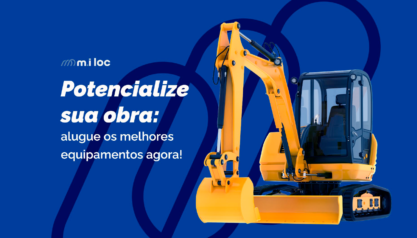
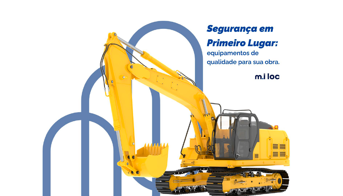
A marca busca destacar-se como uma referência no setor, oferecendo serviços e equipamentos de alta qualidade, enquanto demonstra seu compromisso com a inovação e o profissionalismo.
About [EN]
The creation of M.I Loc's visual identity arises from the need to establish a strong and recognizable presence in the engineering equipment rental market. Therefore, we needed to develop a solid visual identity that conveys trust, professionalism, and expertise in equipment rental. The brand aims to stand out as a reference in the sector, offering high-quality services and equipment while demonstrating its commitment to innovation and professionalism.

Conceito [PT]
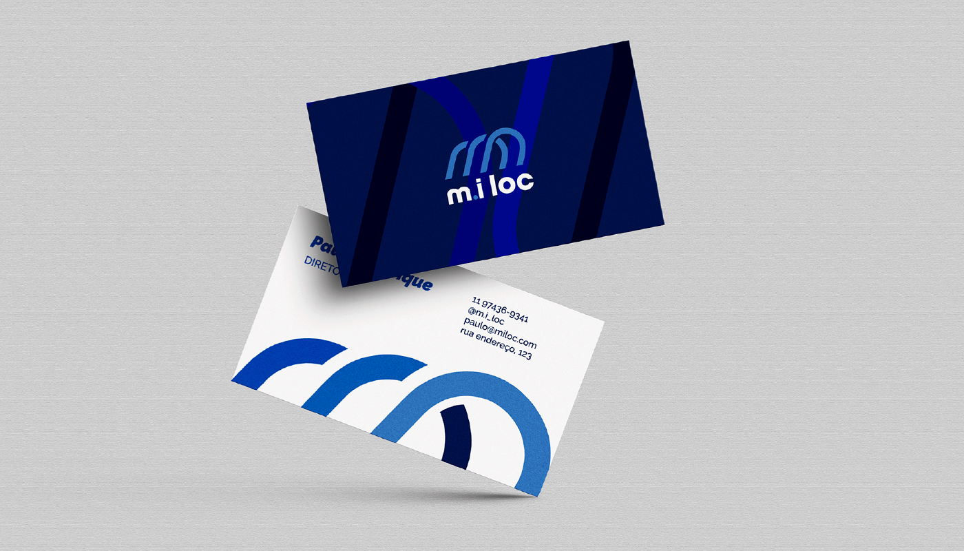
Representação do Setor:
O túnel estilizado representa simbolicamente o setor de obras de engenharia e construção.
Ele evoca a ideia de uma passagem, um caminho para a realização de projetos de
engenharia, que é o foco da empresa.
engenharia, que é o foco da empresa.
O setor de obras muitas vezes envolve a criação de estruturas subterrâneas, túneis
e fundações, e o símbolo faz alusão a essa expertise.
e fundações, e o símbolo faz alusão a essa expertise.
Iniciais da Empresa:
As letras "M" e "I" estilizadas formando o túnel representam as iniciais da empresa,
M.I Loc.
As letras "M" e "I" estilizadas formando o túnel representam as iniciais da empresa,
M.I Loc.
A forma abstrata dessas letras dentro do túnel confere um toque de personalidade
e criatividade ao logotipo, ao mesmo tempo em que mantém, de forma abstrata, as iniciais
Concept [EN]
e criatividade ao logotipo, ao mesmo tempo em que mantém, de forma abstrata, as iniciais
Concept [EN]
Sector Representation: The stylized tunnel symbolically represents the engineering and construction sector. It evokes the idea of a passage, a pathway to the realization of engineering projects, which is the company's focus. The construction sector often involves the creation of underground structures, tunnels, and foundations, and the symbol alludes to this expertise.
Company Initials: The stylized letters "M" and "I" forming the tunnel represent the initials of the company, M.I Loc. The abstract shape of these letters within the tunnel adds a touch of personality and creativity to the logo, while maintaining, in an abstract way, the initials.
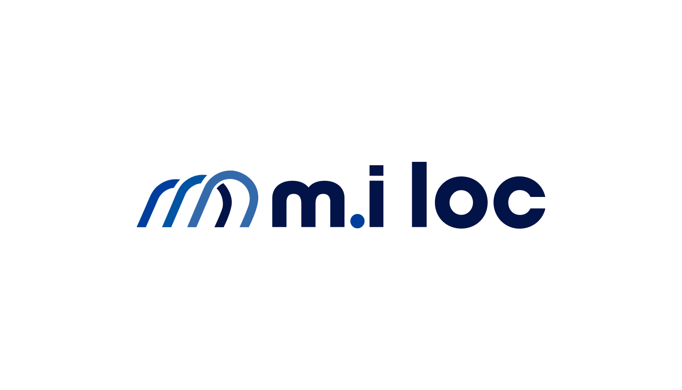
Adição do "."
A inclusão do "." pode melhorar a clareza e a legibilidade da marca.
Anteriormente, a distinção entre as letras "M" e "I" não era imediatamente evidente,
e era lida, muitas vezes, como "mi".
e era lida, muitas vezes, como "mi".
O ponto cria uma separação visual clara entre as duas letras, tornando a marca
mais legível e evitando confusão.
mais legível e evitando confusão.
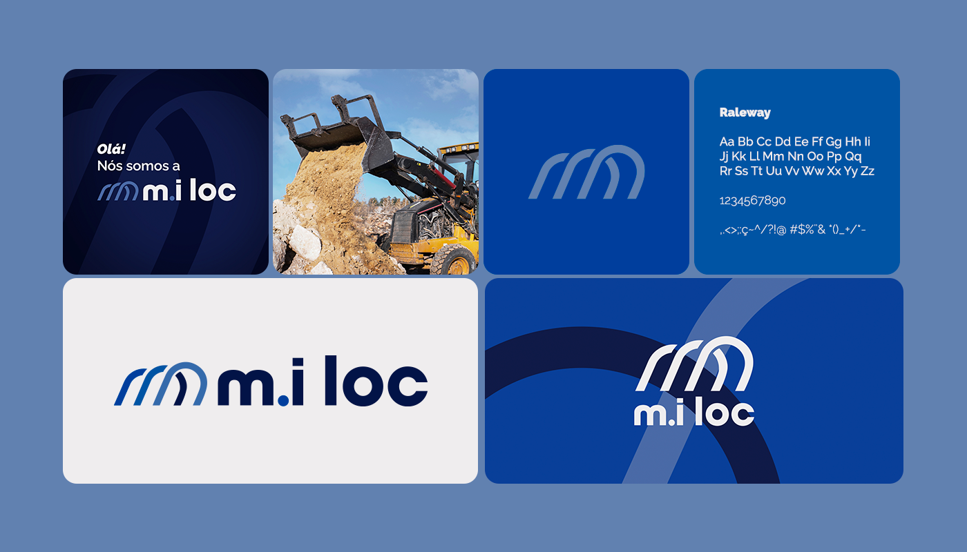
Modernidade, simplicidade e futuro
A tipografia minúscula tende a criar uma aparência mais moderna e limpa e que
tem uma visão de expansão e crescimento futuro.
A tipografia minúscula tende a criar uma aparência mais moderna e limpa e que
tem uma visão de expansão e crescimento futuro.
Isso é especialmente relevante para esta empresa, onde a inovação e a eficiência
são valorizadas.
são valorizadas.
Addition of the ".": The inclusion of the "." can enhance the clarity and readability of the brand. Previously, the distinction between the letters "M" and "I" was not immediately evident, often being read as "mi." The period creates a clear visual separation between the two letters, making the brand more legible and avoiding confusion.
Modernity, Simplicity, and Future: The lowercase typography tends to create a more modern and clean appearance and embodies a vision of expansion and future growth. This is especially relevant for this company, where innovation and efficiency are valued.